Activity Channels Chart
The Activity Channels Chart gives a breakdown of the different activity channels used in the instance. If you move the mouse pointer to the colored regions, it shows the percentage of the activity channel usage.
In the illustration below, the Group Chat is the most widely used activity channel, followed by Open Chat and Project.
If you click on the  button, you can filter the time ranges as follows
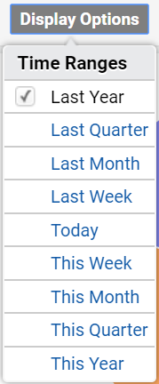
The data will be displayed in the chart for the selected time range.
If you click the  button, a dropdown list will be displayed as follows
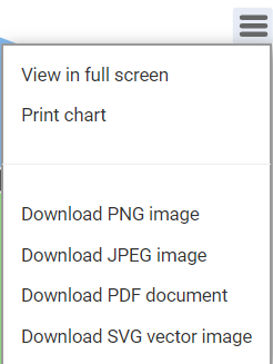
The user can choose from the options.
View full screen- will display the chart full screen
Print Chart- will print the activity channels chart
Download PNG image- will download the chart in PNG format
Download JPEG image- will download the chart in JPEG format
Download PDF document- will download the chart as a PDF document
Download SVG vector image- will download the chart as a SVG vector image
Clicking on the  icon will display a menu as shown below
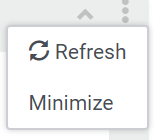
Refresh- will refresh the gadget
Minimize- will minimize the gadget